Rate disparity does not only dent your profits but also harms your hotel brand’s reputation. Maintaining rate parity across all distribution channels is, therefore, critical to your hotel chain.
The complex task of achieving rate parity is all about maintaining ‘rate integrity’ by avoiding the temptation of offering dramatic discounts and, at the same time, having no justification for other guests who bought the same room for a much higher price.
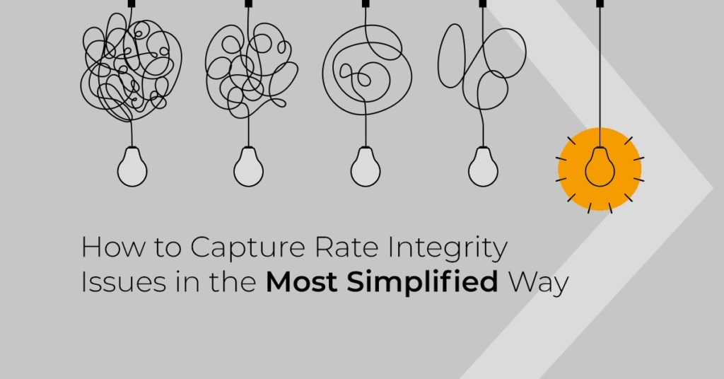
In the last six months, we have spoken to over 100 hospitality leaders to understand their parity-related concerns. Interestingly, their ask is simple: ‘Show me the details of all rate integrity issues in the most simplified and actionable way possible.’
Based on their requirements and our research, we have re-designed our AI-driven rate integrity platform Parity+, to show all the violations upfront and in real-time; it also allows the user to take an appropriate action immediately.
Catering to the simple ask of the hospitality leaders has been a difficult task for us; we took it as a challenge. Once we understood the key problem areas and asks, we created personas, customer journey maps, information architecture and new design language. We also did ‘need versus feature’ analysis to ensure we provide data sets, which are useful for hotel revenue managers; we removed the elements, which were not important.
In all, hospitality leaders have been at the center of this re-design work. We have simplified the complex landscape of rate integrity issues.
How Did We Achieve Simplicity:
The new Parity+ dashboard, which has been completely re-imaged now uses data cards, and lets the users play with the data as well. We show the provisional revenue loss when a distribution channel undercuts you. Here is a look at how we achieved the most simplified way of handling the complex rate integrity issues.
- Inverted pyramid approach: We now show overall parity score, loss, and provisional loss upfront, and then show details of each as you move along.
- Shallow navigation: Almost 80% of your requirements are met from a single page dashboard; one does not have to move from one page to another to find the information.
- Micro-interactions: You can now interact with all charts, which will help you to drill down easily on the same page. We have used overlays instead of opening data sets on a new page
- Easy to scan: We have used data cards and a clean layout, which will help you to scan the data quickly. New color palette has been introduced.
- Feedback – We have incorporated a feedback form to understand on how you are experiencing the product. This will help us to mature it even further.

We have very passionately created this new experience; hope you enjoy it too.
About the Author
 Gaurav Lal
![]()
![]()
Senior Vice President – Product Design
RateGain